
The UX/UI of e-Ink Tablets | 매거진에 참여하세요
The UX/UI of e-Ink Tablets
#elink #tablet #market #display #UX #design #writing #apps


Paper-Like Digital Experiences
e-Ink tablets combine the tactile feel of paper with the convenience of digital devices, creating a unique interaction experience that feels both familiar and innovative.
Recent devices like Paper Pro Move, reMarkable, and Kindle Scribe go beyond being simple e-readers or note-taking tools.
They’re positioning themselves as powerful digital work and study companions.

What is e-Ink?
e-Ink (electronic ink) is a display technology designed to mimic the look of real paper.
Unlike LCD or OLED screens, e-Ink displays consume almost no power when static, allowing them to retain content without draining the battery.
Key benefits include:
- Excellent readability under sunlight
- Reduced eye strain during prolonged use
- Extremely low power consumption
Originally developed by E Ink Corporation, the technology is now used across e-readers, tablets, smartwatches, and even digital signage.
Market Growth
The market is expanding rapidly:
e-Ink tablet market: projected at $2.2 billion in 2024
(Source)

e-Ink display market: projected at $2.5 billion in 2024
(Source)
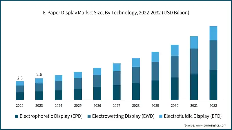
Applications span from e-readers and tablets to signage and wearables, driven by the growing demand for readability and energy efficiency.
Designing for Paper-Like UX
For designers, the core challenge is clear:
How do you preserve the “feel of paper” while unlocking the benefits of digital?
It’s not just about functionality—it’s about crafting a natural, immersive writing experience.
1. Writing That Feels Like Paper
The top priority in UX is how natural writing feels. Key factors:
- Pen pressure sensitivity
- Response time
- Surface friction
The reMarkable 2, for example, minimizes latency and adds subtle resistance to simulate the texture of real paper.
💡 Design takeaway: Optimize pen gestures and writing flow so users feel like they’re writing on actual paper, not glass.
2. Simple but Powerful Interfaces
e-Ink screens refresh more slowly than LCDs. This technical constraint requires minimalist UI design:
- Clean menus and reduced visual clutter
- Gesture-based navigation (e.g., page turns)
- Seamless switching between note-taking and reading modes
💡 Design takeaway: Respect the medium’s limitations. Simplicity = usability.
3. Multimodal Interactions
e-Ink tablets often combine pen, touch, and physical buttons.
Example: While writing, users can press a shortcut button to insert shapes, highlight, or erase.
💡 Design takeaway: Support natural workflows with intuitive gestures and minimal effort.
4. Document Management & Visualization
For study and work, organization is critical:
Page summaries, highlights, and cloud sync
Annotation tools for PDFs and meeting notes
Visual grouping of content for quick comprehension
💡 Design takeaway: Simplify information-heavy tasks into clear, glanceable layouts that boost efficiency.
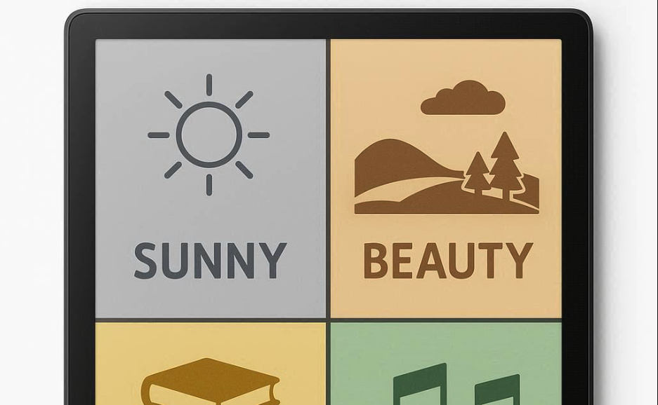
5. Emotional Design Elements
Beyond function, users want warmth and familiarity:
Paper-like themes and textures
Customizable icons and color palettes
Gentle animations and haptic feedback
💡 Design takeaway: Balance practical usability with emotional comfort for long-term engagement.
Toward a New Standard in Learning & Creativity
e-Ink tablets are dissolving the boundary between paper and digital.
For designers, the mission is to work within technical constraints while delivering maximum efficiency, minimal interaction, and an emotional connection.
The future is clear: e-Ink tablets are set to become the new standard for digital learning and creative work.
A world where we can write naturally, manage knowledge seamlessly, and create freely, all on a paper-like digital surface is closer than ever.

- link_kakaolink_kakao_url
- link_operatorlink_operator_url
- link_investhelp@letspl.me
- link_ad_urllink_ad
